Harvest plot tutorial
Introduction
Visualisations are an important tool in systematic reviews for
identifying, demonstrating, and investigating patterns in the reviewed
literature. These are often more efficient and effective than using
text, especially where meta-analysis is not possible (Cochrane
Handbook).
Harvest plots are one way to do this and have been defined by Ogilvie
et al.,
2008
as:
A novel and useful method for synthesising evidence about the differential effects of population-level interventions. It contributes to the challenge of making best use of all available evidence by incorporating all relevant data. The visual display assists both the process of synthesis and the assimilation of the findings. The method is suitable for adaptation to a variety of questions in evidence synthesis and may be particularly useful for systematic reviews addressing the broader type of research question which may be most relevant to policymakers.
We aim to demonstrate how to create a simple harvest plot using R and how this can be extended where there are multiple outcomes and exposures of interest. Our examples come from “Shifting towards healthier transport: carrots or sticks? Systematic review and meta-analysis of population-level interventions” (Xiao et al., 2022). This study aimed to compare the effectiveness of carrot, stick, and combined carrot-and-stick interventions in changing different transport behaviors.
With this in mind, let’s get plotting!
Setup
Load R Packages
Load the relevant packages:
library(readxl)
library(tidyverse)
library(knitr)
library(ggpubr)
Load data
We first start using the following dataset to create our simple version of the harvest plot.
df = tibble(
  direction_effect = factor(c("Decrease", "Decrease", "Decrease", "Decrease", "Decrease",
                              "Decrease", "Decrease", "Decrease", "Decrease", "Decrease",
                              "Decrease", "Decrease", "Decrease", "Decrease", "Decrease",
                              "Decrease", "Decrease", "Decrease", "Decrease", "Decrease",
                              "No change","No change","No change","No change","No change",
                              "No change", "Increase", "Increase", "Increase", "Increase",
                              "Increase", "Increase", "Increase", "Increase"),
                            levels = c("Decrease", "No change", "Increase")) ,
  stat_sig = factor(c("Yes","No","No","No","Yes","Yes","No","Yes","N/A","N/A","N/A",
                      "N/A","N/A","N/A","N/A","N/A","N/A","N/A","N/A","N/A","No","N/A",
                      "No","No","N/A","N/A","N/A","No","Yes","Yes","No","N/A","N/A","No"),
                    levels = c("N/A", "No", "Yes")),
  quality = c(3,3,3,3,2,2,2,2,1,1,1,1,1,1,1,1,1,1,1,1,2,1,1,1,1,1,1,3,2,2,1,2,1,1),
  n_interventions = c(1,1,1,2,3,3,4,1,1,1,1,1,1,1,1,1,1,2,2,1,4,1,1,1,1,1,1,4,2,2,1,1,2,1),
  position = c(1,3,4,2,5,6,8,7,11,12,13,14,15,16,17,18,19,9,10,20,10,12,11,9,8,13,13,20,19,
               18,16,17,14,15))
And this is what the data frame looks like:
knitr::kable(head(df), format = "pipe")
| direction_effect | stat_sig | quality | n_interventions | position |
|---|---|---|---|---|
| Decrease | Yes | 3 | 1 | 1 |
| Decrease | No | 3 | 1 | 3 |
| Decrease | No | 3 | 1 | 4 |
| Decrease | No | 3 | 2 | 2 |
| Decrease | Yes | 2 | 3 | 5 |
| Decrease | Yes | 2 | 3 | 6 |
Defining variables
The following defines each variable in the simplified harvest plot dataset:
- position: (Numeric) Placement of the individual study outcome in
the harvest plot
- direction_effect: (Factor) Whether there was an increase,
decrease, or no change in the outcome
- stat_sig: (Factor) Whether the difference was found to be
statistically significant. This will be represented by the shading
of the bars
- quality: (Numeric) Indicates the study quality. We have three
categories here: low, moderate, and high, converted into a numeric
variable (1 = low, 2 = moderate, 3 = high). This will be represented
by the height of the bars
- n_interventions: (Numeric) The number of intervention
components, as represented by a number above each bar
Setting the position of bars representing each study
For this basic example, we manually set the position of the bars using the variable position. Bars are positioned at the extremities of the facets (for decrease and increase) or in the middle (for no change). Within each facet, the bars are sorted by the characteristics plotted, in order of precedence. In this case bars were sorted by study quality, significant and number of intervention components. It is usual to sort initially by the same characteristic used to determine bar height. If this doesn’t immediately make sense, hopefully the examples below will illustrate how the position of the bars in the three columns.
Basic harvest plot
The data allow us to visualise the evidence to support each of three competing hypotheses about a change in travel mode as a result of an intervention, in addition to several additional characteristics of the studies and their outcomes. Initially we create a plot that conveys the evidence consistent with a decrease, increase or no change in travel, along with the study quality.
ggplot(df, aes(y=quality, x=position)) + geom_bar(stat="identity") +
  facet_grid(cols = vars(direction_effect))
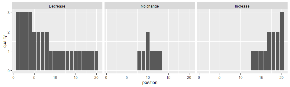
Using the facet_grid option we disaggregate the studies based on their outcomes, allowing us to see the number of studies supporting each finding. The height of the bars indicating study quality facilitates a comparison of the strength of evidence for each finding.
We can add further data about each study or its findings to better visualise the nature of the evidence base.
To set the colour scheme:
cbPalette <- c("#A9C5D0","#FFB7B0","#ADA7A7")
Plotting the figure with colours and labels to further differentiate between studies:
ggplot(df, aes(y=quality, x=position, fill = stat_sig)) + geom_bar(stat="identity") +
  facet_grid(cols = vars(direction_effect)) + scale_fill_manual(values=cbPalette, breaks=c("Yes","No","N/A")) +
  guides(fill = guide_legend("Significant")) +
  geom_text(aes(label=n_interventions), position=position_dodge(width=0.9), vjust=-0.4)
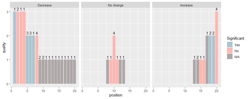
We can now see the statistical significance of the findings for each study (colour) and the number of intervention components (number above each bar). The most important characteristics will likely differ depending on the specific research question being addressed, and reviewers can tailor the harvest plots to their needs.
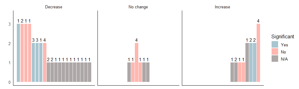
The following code makes it easier to distinguish between the bars and the background.
ggplot(df, aes(y=quality, x=position, fill = stat_sig)) + geom_bar(stat="identity") +
  facet_grid(cols = vars(direction_effect)) + scale_fill_manual(values=cbPalette, breaks=c("Yes","No","N/A")) +
  guides(fill = guide_legend("Significant")) +
  geom_text(aes(label=n_interventions), position=position_dodge(width=0.9), vjust=-0.4) +
  theme(strip.placement = "outside")+ scale_y_continuous("", limits=c(0,3.5)) +
  theme_minimal(base_size = 12) +
  annotate("segment", x=-Inf, xend=Inf, y=-Inf, yend=-Inf) +
  annotate("segment", x=-Inf, xend=-Inf, y=-Inf, yend=Inf) +
  theme(axis.title.x=element_blank(),
        axis.text.x=element_blank(),
        axis.ticks.x=element_blank()) +
  theme(panel.grid.major = element_blank(),
        panel.grid.minor = element_blank(),
        panel.background = element_blank())
Including more exposures
If you have a dataset with more than one outcome and exposure, the following section provides guidance on how to create a harvest plot that would allow you to compare multiple outcomes and exposures.
Loading data
First, we load the data:
#data_harvest <- readRDS(url("https://github.com/christina-s-xiao/harvest_plot/raw/revise/harvest_plot_data.rds"))

data_harvest <- readRDS("harvest_plot_data.rds")
And this is what the new loaded dataset looks like:
knitr::kable(head(data_harvest))
| study_id | outcome_mode | stat_sig | quality | n_interventions | cs_category | direction_effect | position |
|---|---|---|---|---|---|---|---|
| 52 | Driving | Yes | 3 | 1 | Carrot | Decrease | 1 |
| 61 | Driving | No | 3 | 2 | Carrot | Decrease | 2 |
| 36 | Driving | No | 3 | 1 | Carrot | Decrease | 3 |
| 91 | Driving | No | 3 | 1 | Carrot | Decrease | 4 |
| 30 | Driving | Yes | 2 | 3 | Carrot | Decrease | 5 |
| 41 | Driving | Yes | 2 | 3 | Carrot | Decrease | 6 |
Here, we have a few more variables, as defined below:
- study_id: Unique study identifier
- outcome_mode: Outcome of interest in your review. This can be a
single outcome or many. Here, we are interested in looking at
driving and public transport
- cs_category: Exposure or category of studies to be compared,
which will be placed in separate rows
Postion
An alternative to manually specifying the position of observations in the harvest plot is to use some code. The example below works with this data and can be adapted as necessary.
data_harvest = data_harvest %>%
  group_by(cs_category, direction_effect, outcome_mode) %>% # group by column variable (and row variables if you're using them)
  arrange(desc(quality), desc(stat_sig), desc(n_interventions), .by_group = TRUE) # sort by quality measures in order of precedence

c = count(data_harvest, direction_effect, outcome_mode,cs_category, .drop = TRUE) # count the number of studies in each group

n = max(c$n) # number of studies in the group with the most studies

v = c(0, rep(1:n, each = 2, length.out = n-1)) * c(-1, 1) + floor(n/2) # creates a position vector starting in the middle and working out for "No change" column

c = left_join(c,
              tibble(
                direction_effect = c("Decrease", "No change" ,"Increase"),
                order = list(seq_len(n),
                             v[seq_len(n)],
                             seq(n,1,-1)))
) # joins the correct position vector to each group

## Joining, by = "direction_effect"

l = lapply(seq_len(nrow(c)), function(x) c$order[[x]][seq_len(c$n[x])]) # collect the position vector for each group

data_harvest$position = unlist(l) # add the new position variable to the dataset
Creating separate plots for each outcome
First, we will plot the harvest plot for driving outcomes, which we will later combine with the public transport outcomes in a separate figure. To do so, we create two new datasets called ‘drive’ and ‘public_transport’.
drive <- data_harvest[data_harvest$outcome_mode == 'Driving', ]
public_transport <- data_harvest[data_harvest$outcome_mode == 'Public transport', ]
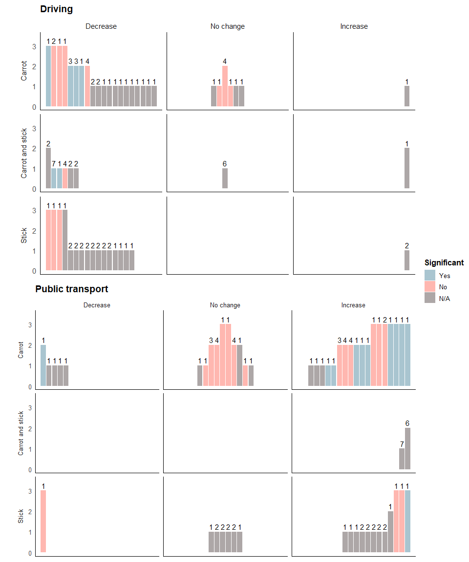
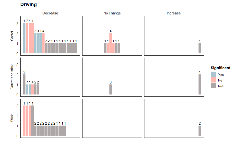
Driving harvest plot
The following code plots the harvest plot for the driving outcome.
We start building the harvest plot, specifying that the colour of each bar is represented by the variable stat_significant, the height of each bar by quality, the number of interventions is labelled above each bar by n_interventions, and the position of each bar by position. We then add bars to represent each study.
drive_a<- ggplot(drive, aes(fill=stat_sig, y=quality, x=position, label = study_id)) +
  geom_bar(position="dodge", stat="identity") + # Adding bars to the plot
  scale_fill_manual(values=cbPalette, na.translate=FALSE, breaks=c("Yes","No","N/A")) + # Adding colours to the bars
  geom_text(aes(label=n_interventions), position=position_dodge(width=0.9), vjust=-0.4) # Adding annotated number of interventions above each bar
Next, we use the facet_grid option to specify that we want cs_category as our rows and direction_effect as our columns.
drive_b<- drive_a + facet_grid(cs_category~direction_effect,
   switch = "y", space='free_x') + theme_minimal(base_size = 14)
The following code formats the figure so it’s easier to distinguish between the different rows and columns:
drive_c <- drive_b +  theme(strip.placement = "outside") +
  scale_y_continuous("", limits=c(0,3.5)) +
  theme(plot.title = element_text(size = 14, face = "bold"),
        legend.title=element_text(size=12,  face = "bold"),
        legend.text=element_text(size=10)) +
  annotate("segment", x=-Inf, xend=Inf, y=-Inf, yend=-Inf) +
  annotate("segment", x=-Inf, xend=-Inf, y=-Inf, yend=Inf) +
  theme(axis.title.x=element_blank(),
        axis.text.x=element_blank(),
        axis.ticks.x=element_blank()) +
  theme(panel.grid.major = element_blank(),
        panel.grid.minor = element_blank(),
        panel.background = element_blank())
Specifying the title and legends:
drive_final <- drive_c + guides(fill = guide_legend("Significant", nrow = 3)) +
  theme(legend.position="right") + labs(title="Driving")
The final plot should look like this:
drive_final
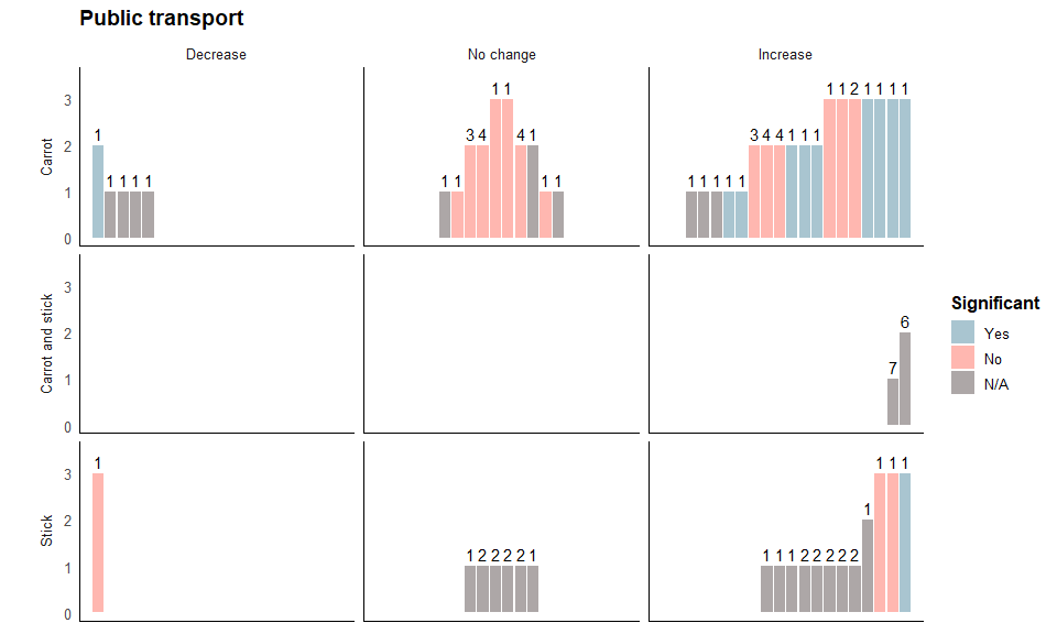
Public transport harvest plot
Repeat the steps above for the public transport outcomes, as below:
pt_final<- ggplot(public_transport, aes(fill=stat_sig, y=quality, x=position, label = study_id)) +
  geom_bar(position="dodge", stat="identity") + scale_fill_manual(values=cbPalette, na.translate=FALSE, breaks=c("Yes","No","N/A")) +
  geom_text(aes(label=n_interventions), position=position_dodge(width=0.9), vjust=-0.4) +
  facet_grid(cs_category~direction_effect,
   switch = "y", space='free_x') + theme_minimal(base_size = 12) +
  theme(strip.placement = "outside")+ scale_y_continuous("", limits=c(0,3.5)) +
  theme(plot.title = element_text(size = 14, face = "bold"),
        legend.title=element_text(size=12,  face = "bold"),
        legend.text=element_text(size=10)) +
  annotate("segment", x=-Inf, xend=Inf, y=-Inf, yend=-Inf)+
  annotate("segment", x=-Inf, xend=-Inf, y=-Inf, yend=Inf) +
  theme(axis.title.x=element_blank(),
        axis.text.x=element_blank(),
        axis.ticks.x=element_blank()) +
  theme(panel.grid.major = element_blank(),
        panel.grid.minor = element_blank(),
        panel.background = element_blank()) +
  guides(fill = guide_legend("Significant", nrow = 3)) +
  theme(legend.position="right") + labs(title="Public transport")
The final plot should look like this:
pt_final
Creating the final combined harvest plot
We then use the ggarrange function to plot both the driving and public transport harvest plot figures together:
ggarrange(drive_final, pt_final, hjust = -0.5,
                    ncol = 1, nrow = 2, common.legend = TRUE, legend='right')